Last Thursday, the new look of visitmanchester.com was revealed and celebrated with a launch party. The website is supposed to be the ‘official tourism website for Greater Manchester‘ and provides information from fun and informal (5 top cheap eats in Manchester et al) to business related (such as conferences and hotel bookings). Naturally, such a wide range of topics and huge amounts of information, along with the technical requirements poses a real challenge for web designers and developers.
Given the rather enthusiastic twitter comments about the new website, I was keen to have a look at it, expecting something nice, neat, user friendly and visually pleasing. The following dialogue then took place between my 14 year old (that was in the 1990s!) hyperactive internet-ecstatic persona and my current cynical, Manchester-critical, internet-bored and rather boring 24 year old self:
Me then: “WOAH this is awesome! Everything’s moving!!1!!!11!”
Me now: “WHAT THE HELL IS GOING ON HERE?!”
Me then: “CHECK THAT OUT! The navigation DISAPPEARS and then COMES BACK! They must have used FLASH, that is soooo cool!”
Me now: “JESUS CHRIST why is everything…what…where has the navigation gone… ah there it is… hang on, is this a one-page-website? That’s cool actually! One-page websites are the future.”
Me then: “MAAAN there’s like, wavy lines coming down, in different colours, and text, and photos of random people! This is THE FUTURE! I WANT TO BOUNCE AROUND! LOL!” (downs another pint of peach ice tea. I used to drink several pints of this stuff a day, going from one sugar high to the next.)
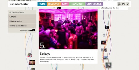
Me now: “Why are there photos of random people and overlapping text snippets in the background? I can’t read anything. Is that a twitter feed or something? I don’t get it. Wait… this is not a one-page navigation, only the top boxes stay the same. Oh, no it is actually… everything I’ve seen so far is still on the page! How handy. And confusing.” (left eye starts twitching)
Me then: “So many totally cool boxes EVERYWHERE! I LOVE boxes! I love CSS! CSS boxes are the FUTURE!”
Me now: “Where is the navigation gone now? Eh… I feel dizzy… they could have aligned the boxes at least. Why does the menu on the left appear twice? What… Oh it says ‘Deutsch’, let’s see if they’ve got a proper translator. Whoops… no… that German looks very English to me. Huh?”
Me then: “Colours!”
Me now: “I don’t feel well…”
Me then: “Wavy lines!!”
Me now: “This is confusing…”
Me then: “Mouse over effects! I LOVE mouse over effects!”
Me now: “What is happening to me…”
Me then: “Live Twitter feeds*!”
Me now: “Everything is spinning… uugghh…”
Me then: “Maaan when I grow up I want to MAKE COOL WEBSITES, like, totally!!”
Me now: “Make it stop, please. Please!!” (curls up in a ball and stares at a blank wall for half an hour)
Me then: “Man, you’re lame. Duh.”
While I don’t have doubts about the usefulness and quality of the content, I couldn’t possibly imagine using visitmanchester.com for anything other than casual browsing and exploring. I really don’t want to actually search for any particular information there – the website is just too confusing.
Thanks to magneticNorth for giving me the shakes and five minutes of insanity. Don’t take it personal, but WOAH! This is one mess of a website. I suppose if you test it on the over 50′s next time (Happy belated Silver Surfers’ day by the way) you could produce something less headspinning.
Time for my Horlicks now!
Edit: They made a video about the launch as well, featuring an interview with the creative director of magneticNorth (who I confused with Gary Lineker first). “Neverending cascade of information” is quite appropriate and sounds as scary as it looks. “Hopefully this will spread out…” Yeah…but… no. Please don’t.
* Ok so this is nonsense. We didn’t even have facebook then, let alone twitter. It was geocities all the way.

You must be logged in to post a comment.